moro.
Brand identity / Packaging / Campaign
01 / The ideaA different
A different
point of view.
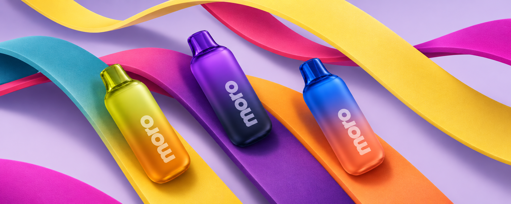
Moro is built around three distinct moods and one unmistakable visual language.
Bold type, saturated gradients and translucent details turn an everyday object into a colourful, tactile world.
Creative direction · Identity · Campaign02 / Identity
moro.
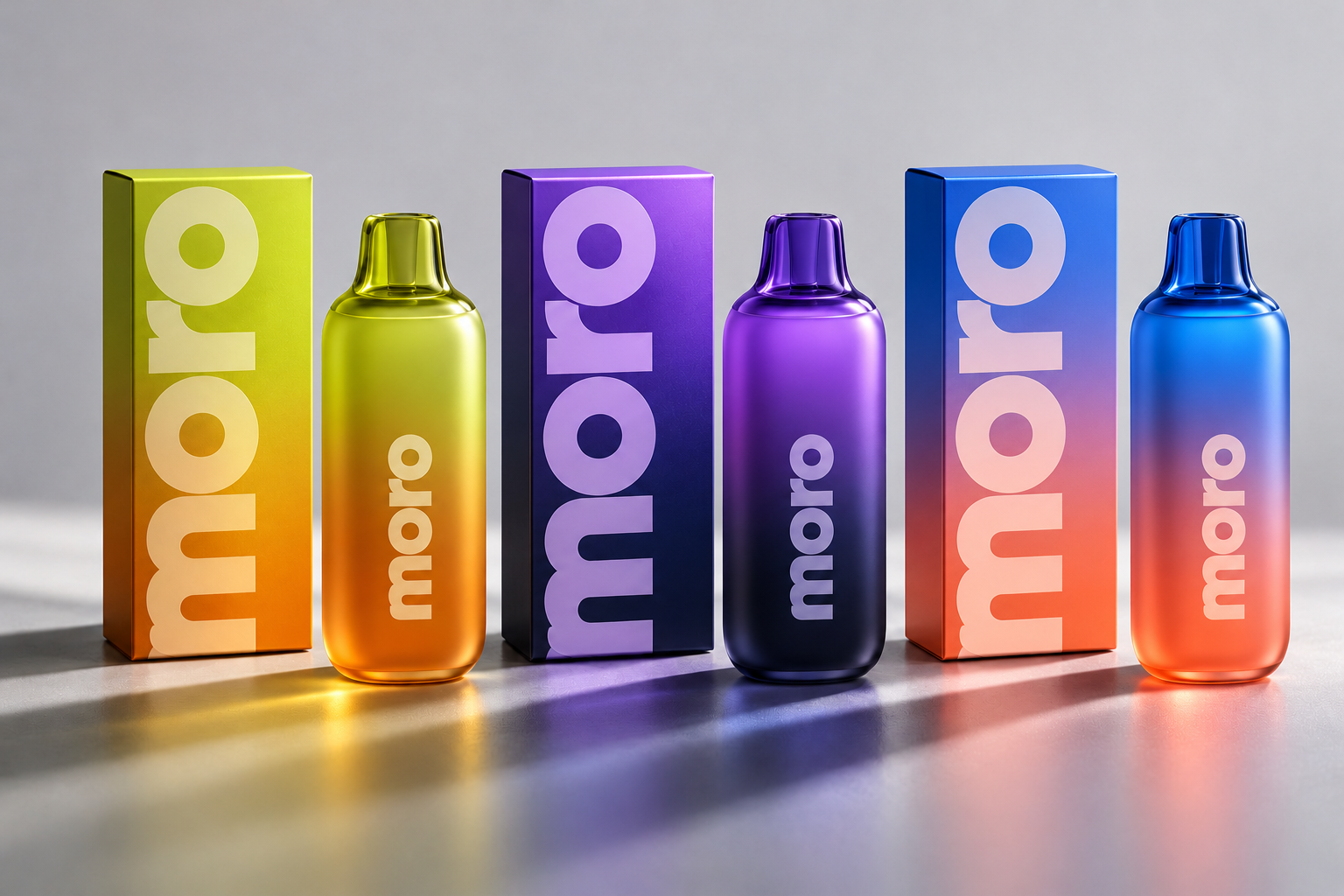
A confident, rounded wordmark gives the system its voice. It scales from a quiet detail on the product to an oversized graphic statement.
01 / BRIGHT
02 / CALM
03 / BALANCE
03 / Product designThree ways
Three ways
to see it.
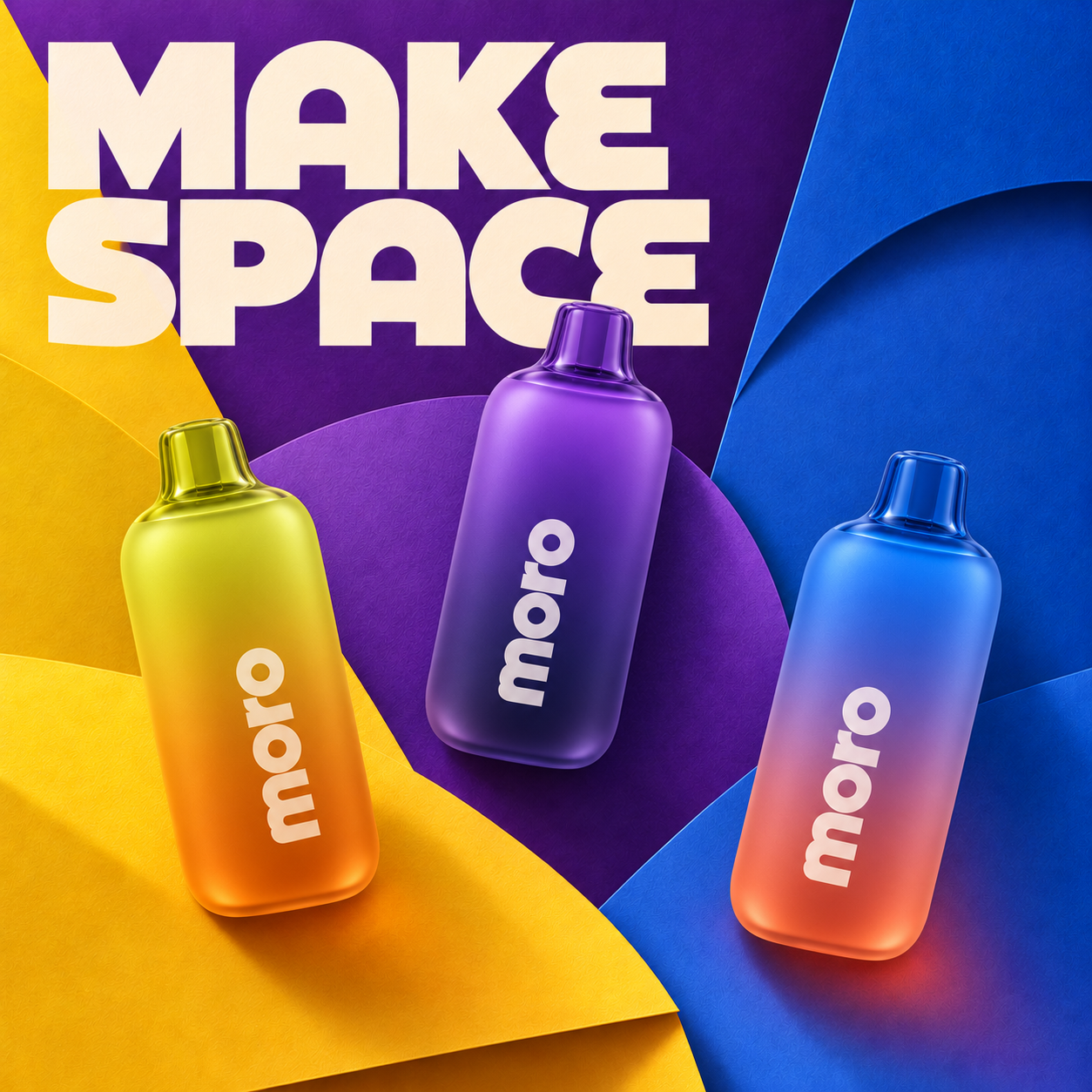
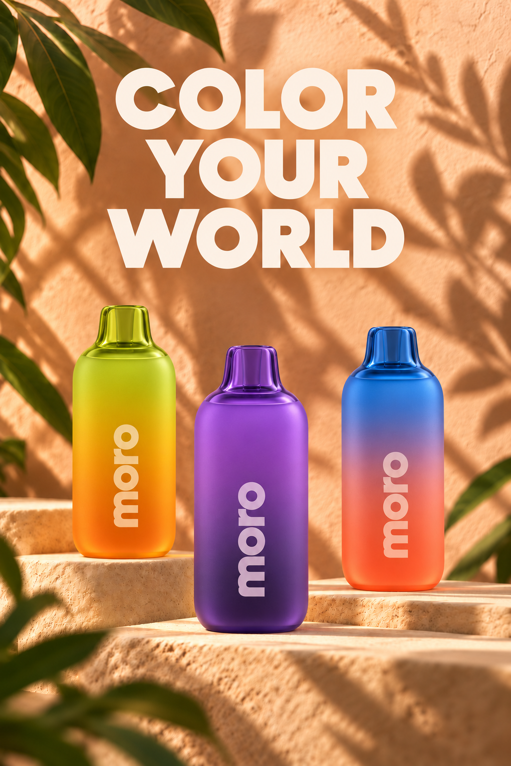
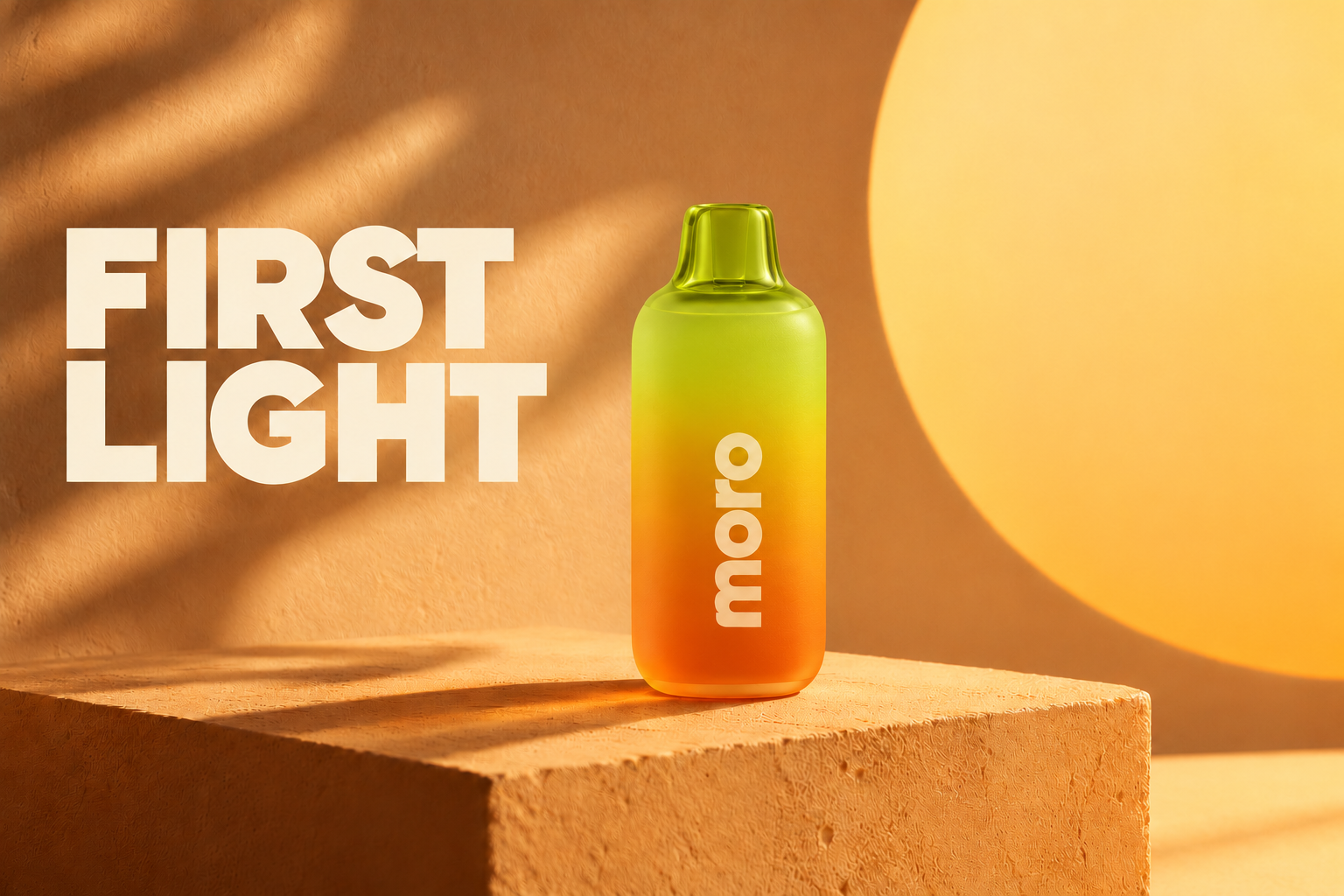
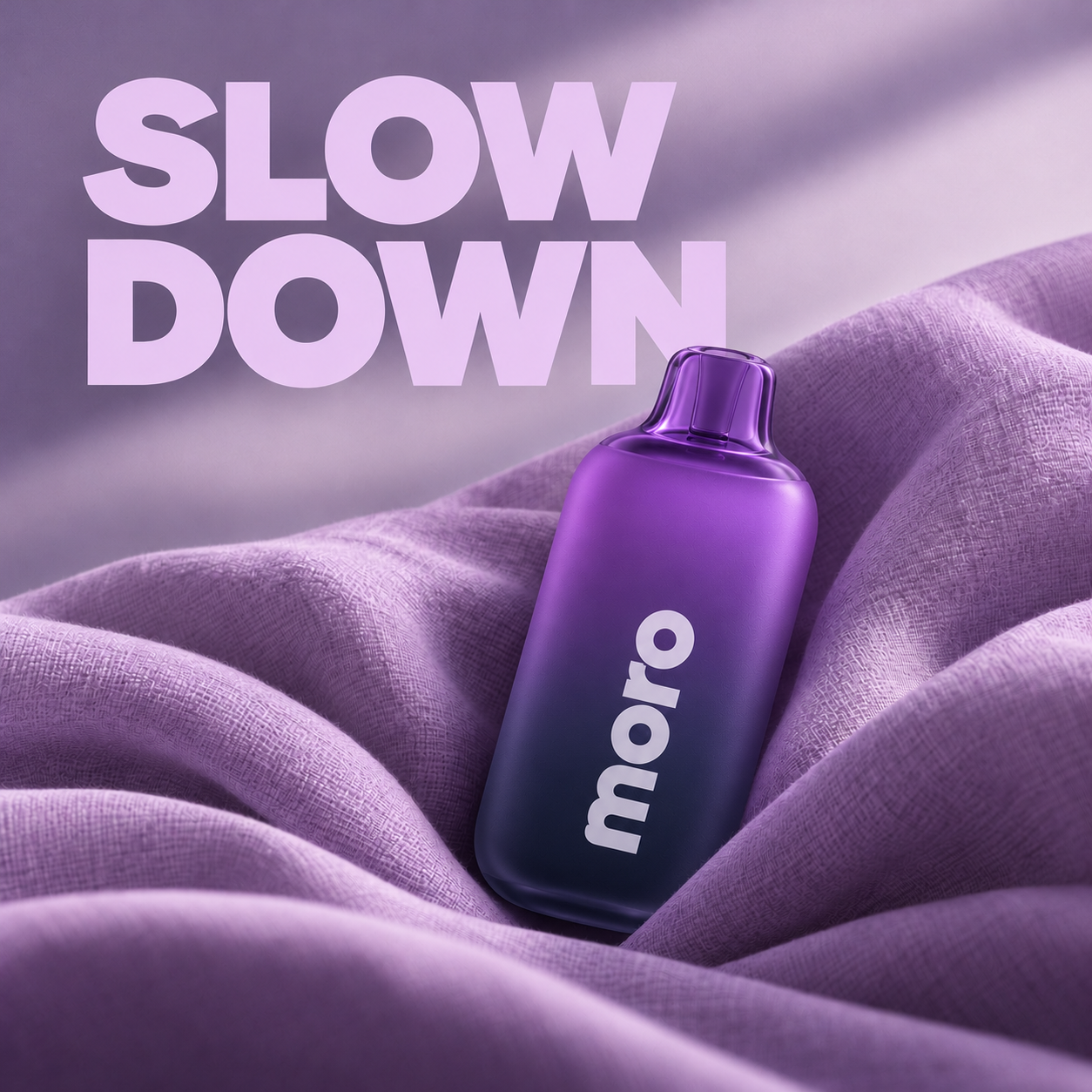
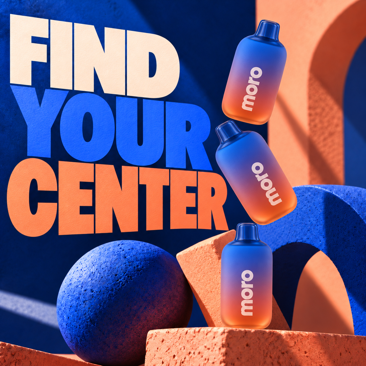
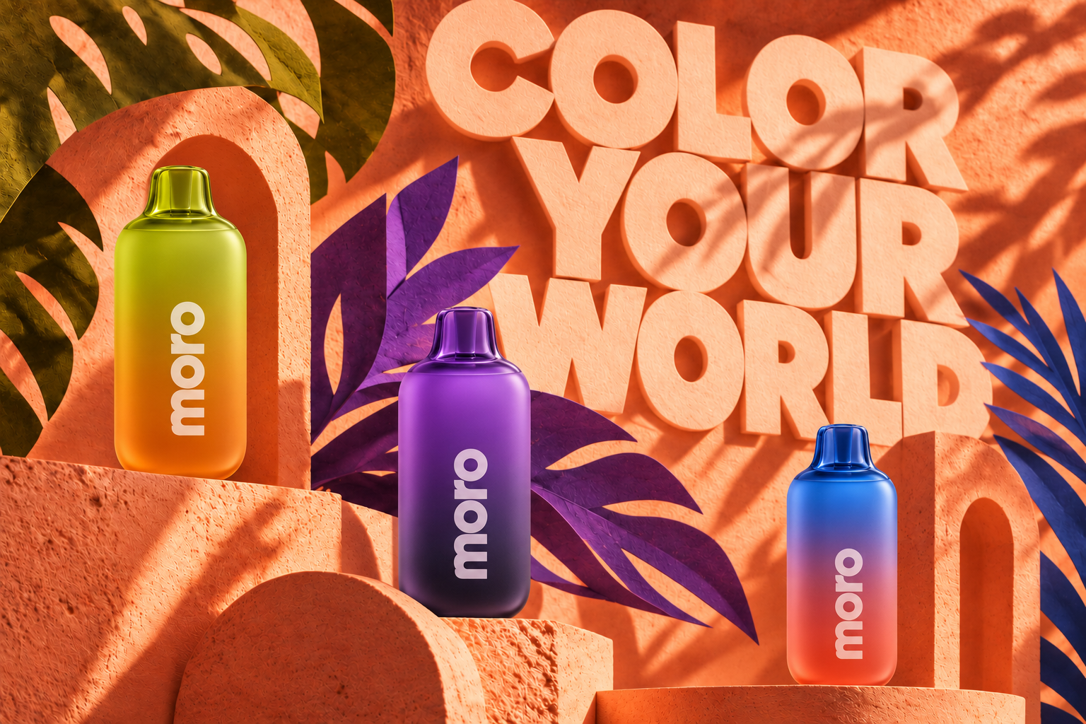
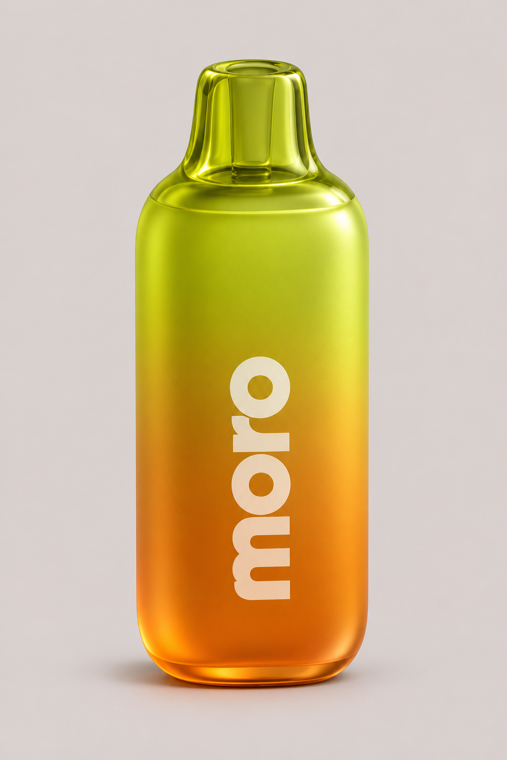
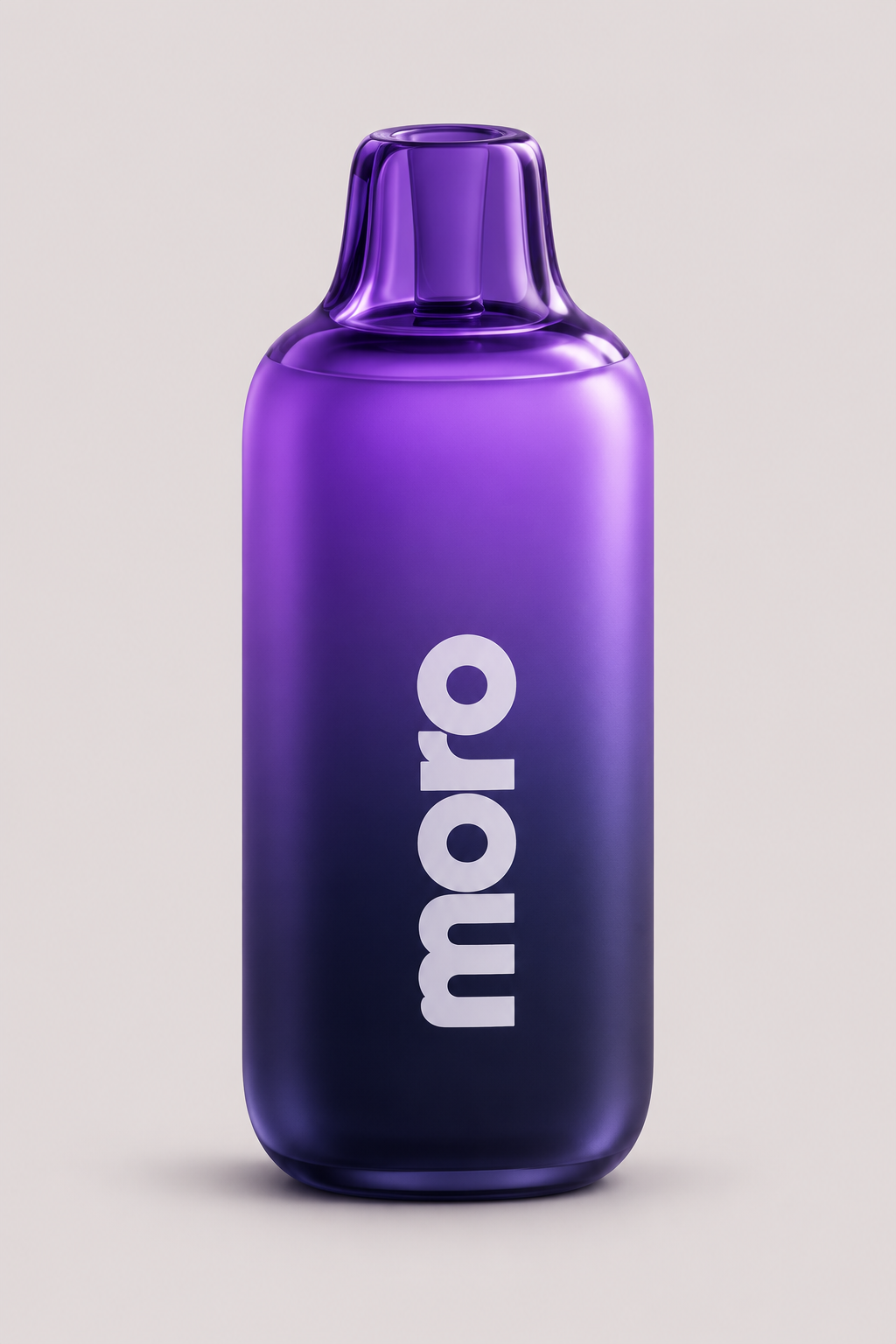
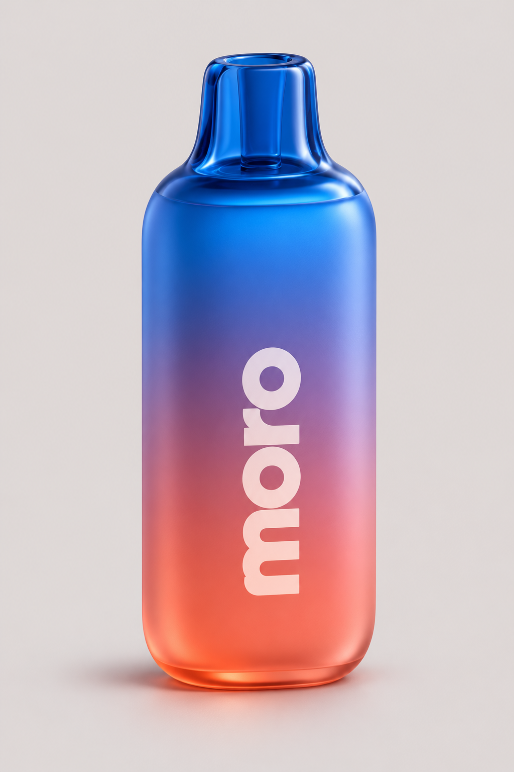
One form, three colour worlds. Frosted gradients and transparent tinted tips bring depth and distinction to the range.
ONE MORO.
04 / CampaignMake space
Make space
for colour.
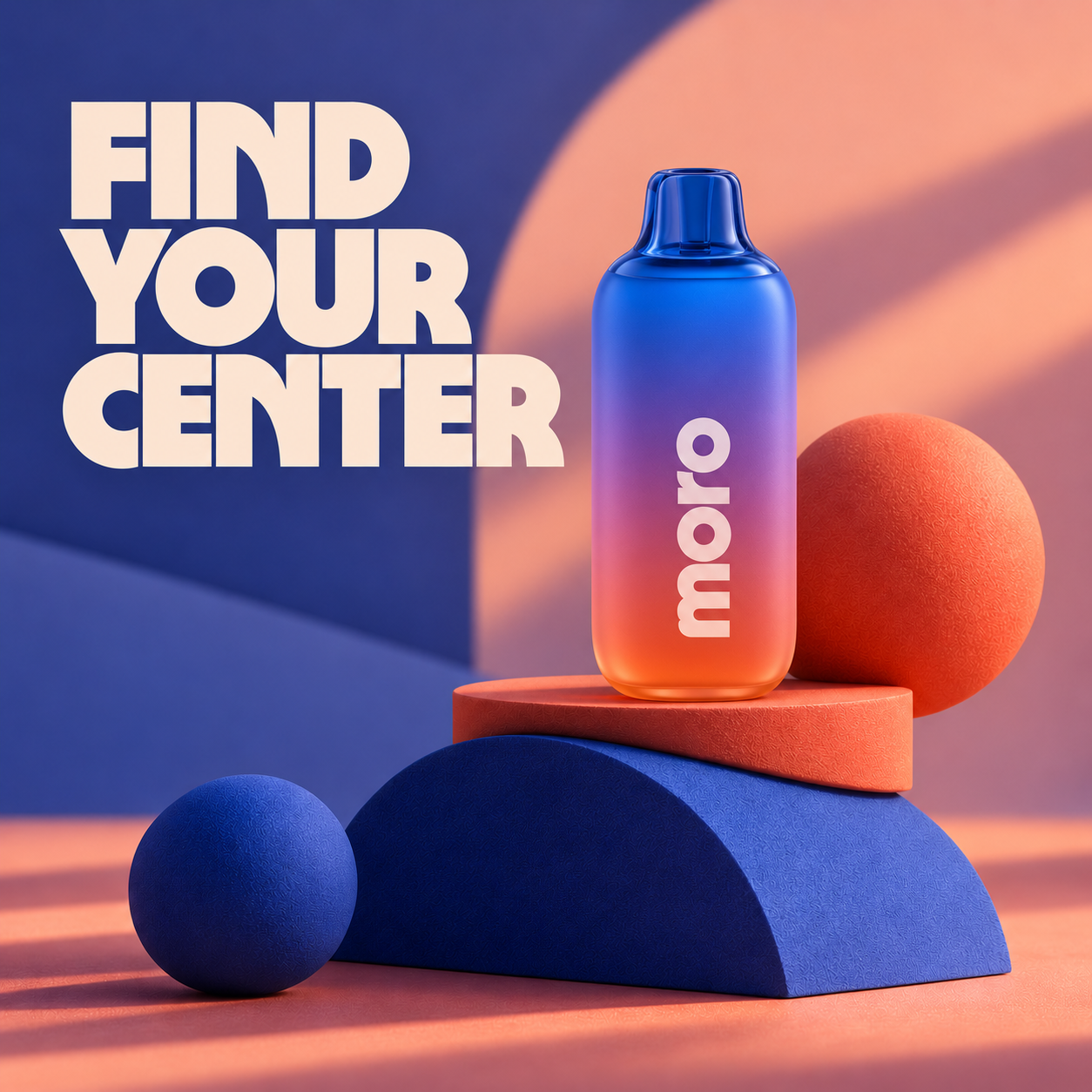
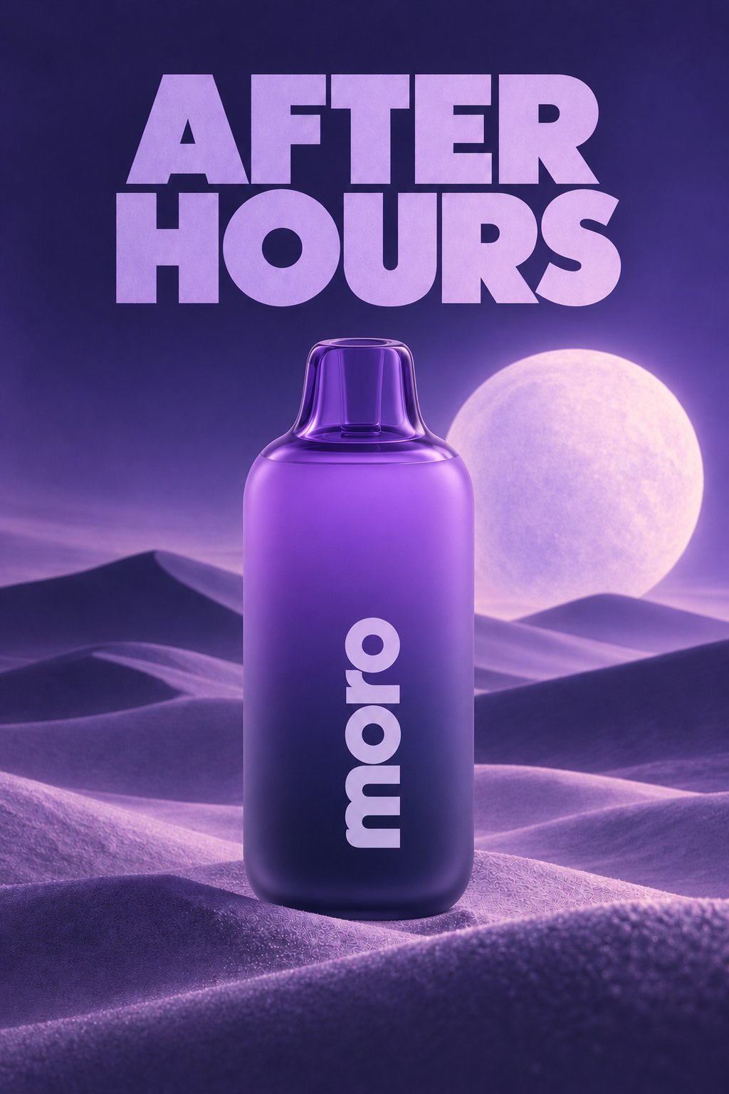
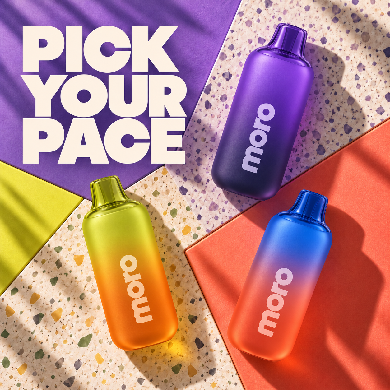
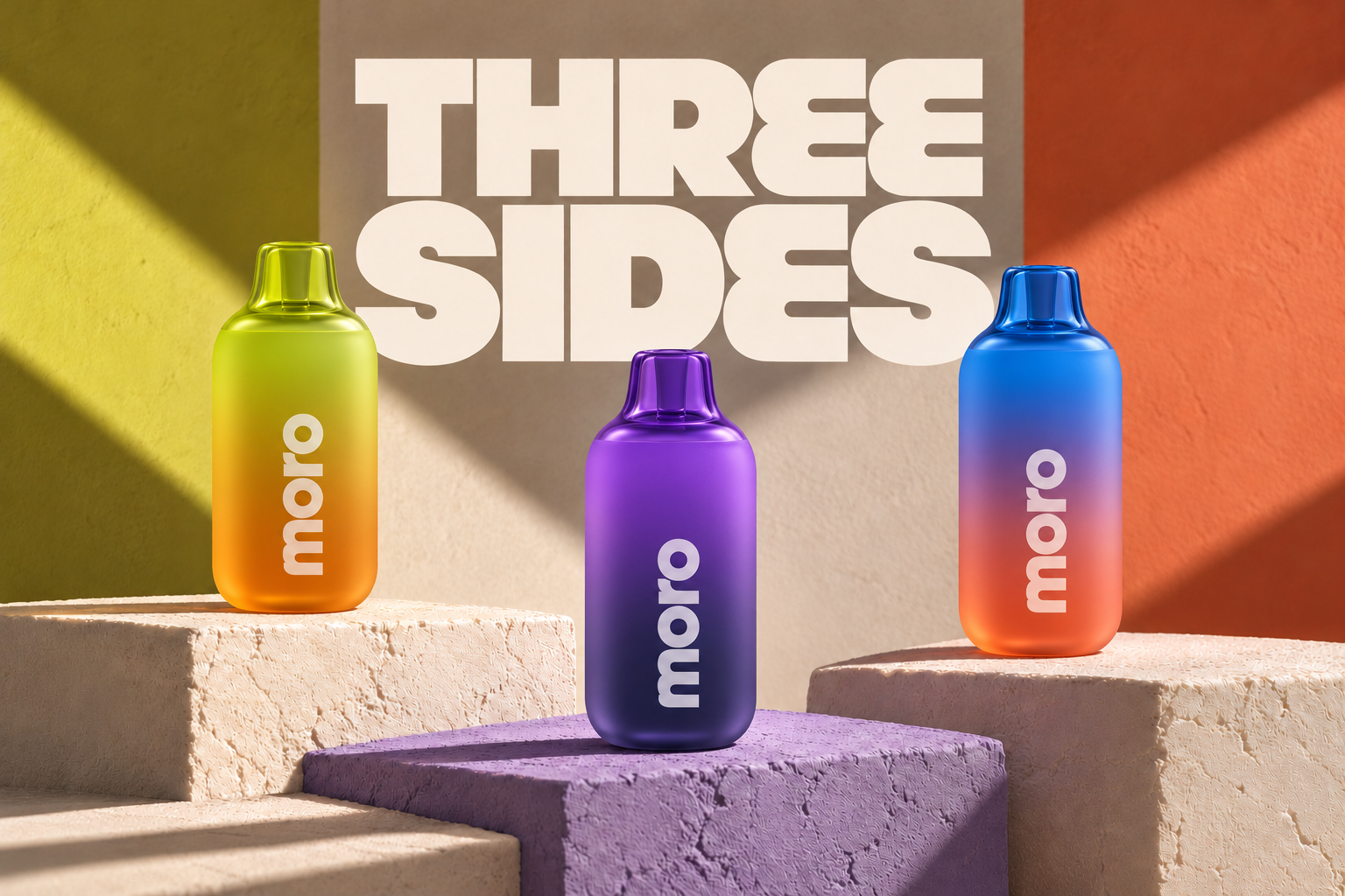
Surreal scale, tactile sets and expressive light translate each colourway into a visual world of its own.