THE BRIGHT WAY.
ON SCREEN.
Commercial concept storyboard
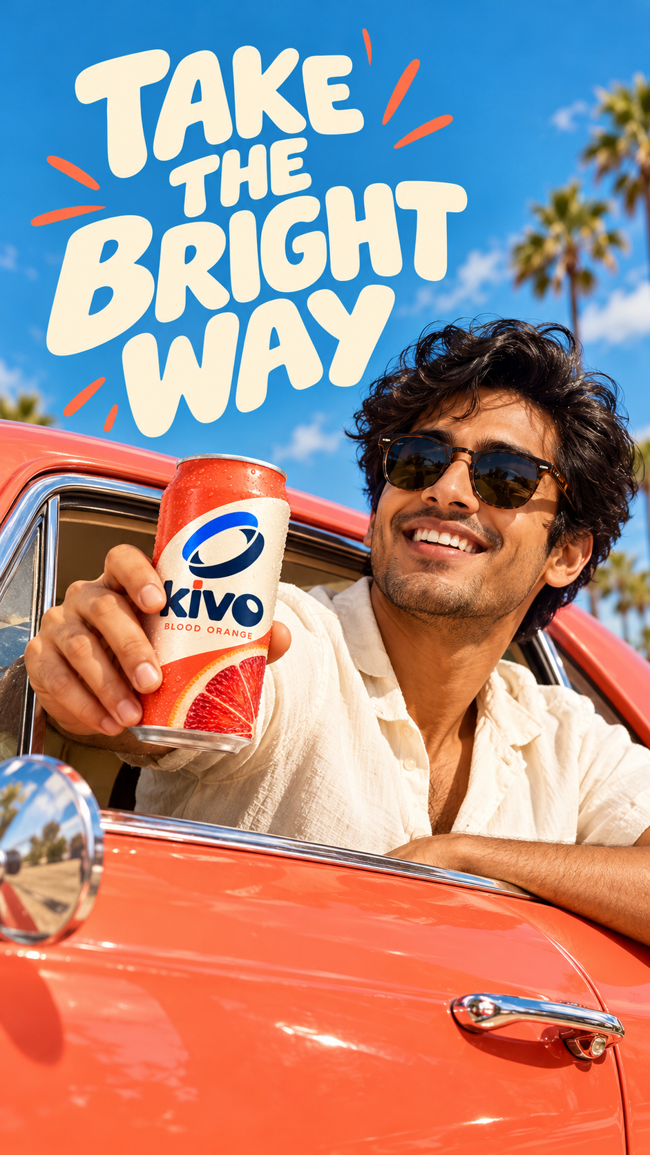
01 / A sunny day. A trip begins.
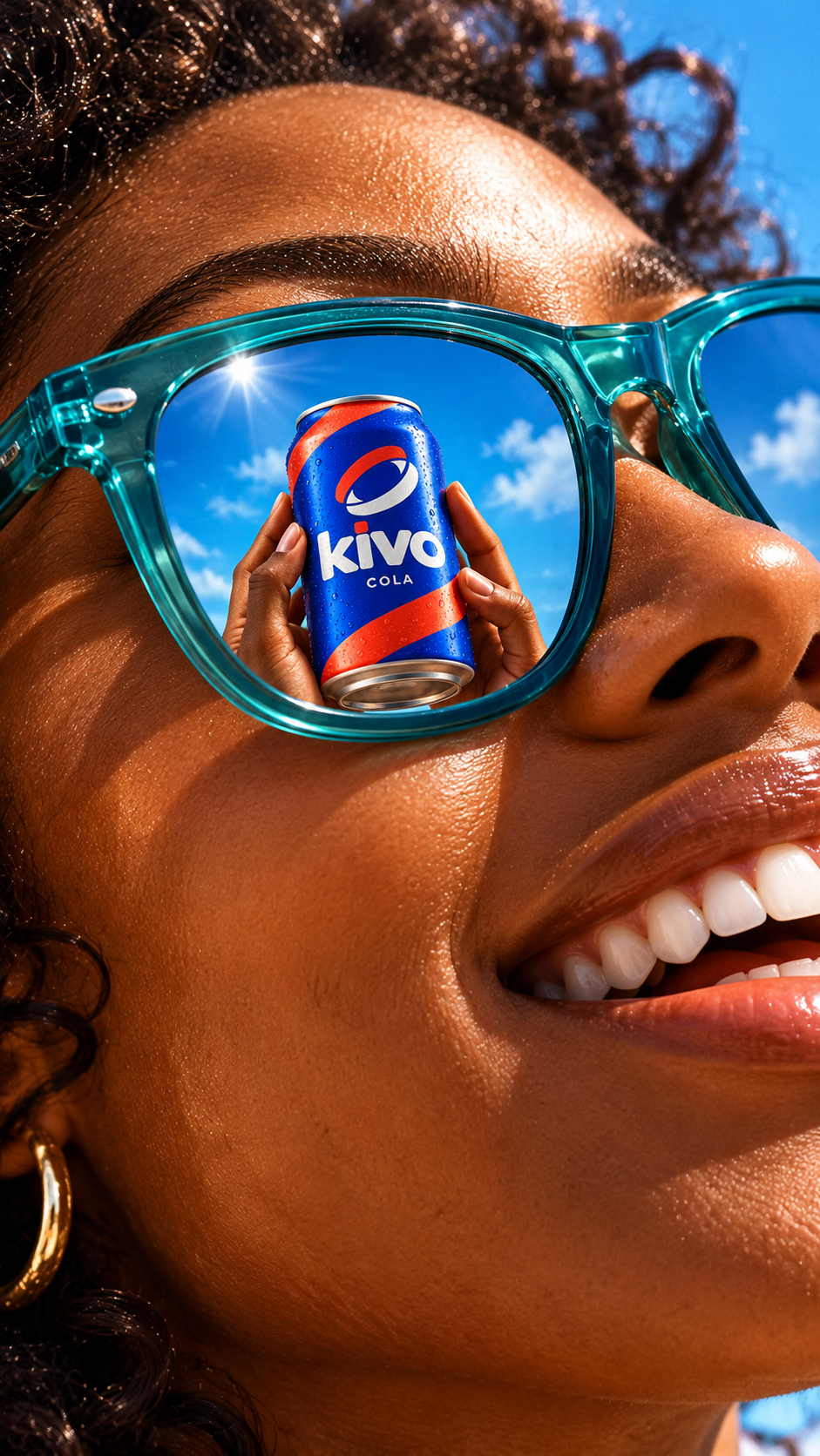
02 / Refreshment comes into view.
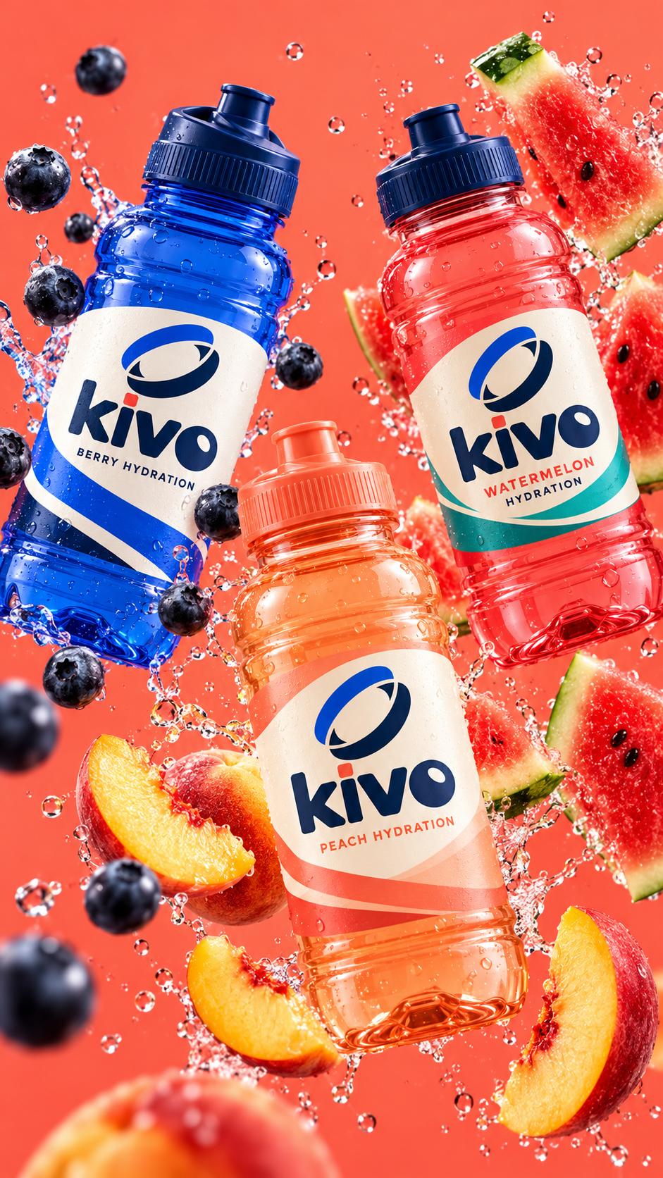
03 / The KIVO family closes the film.
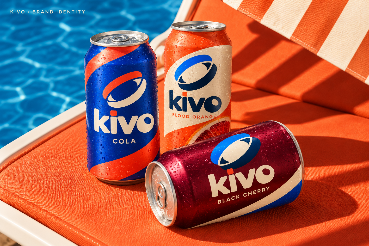
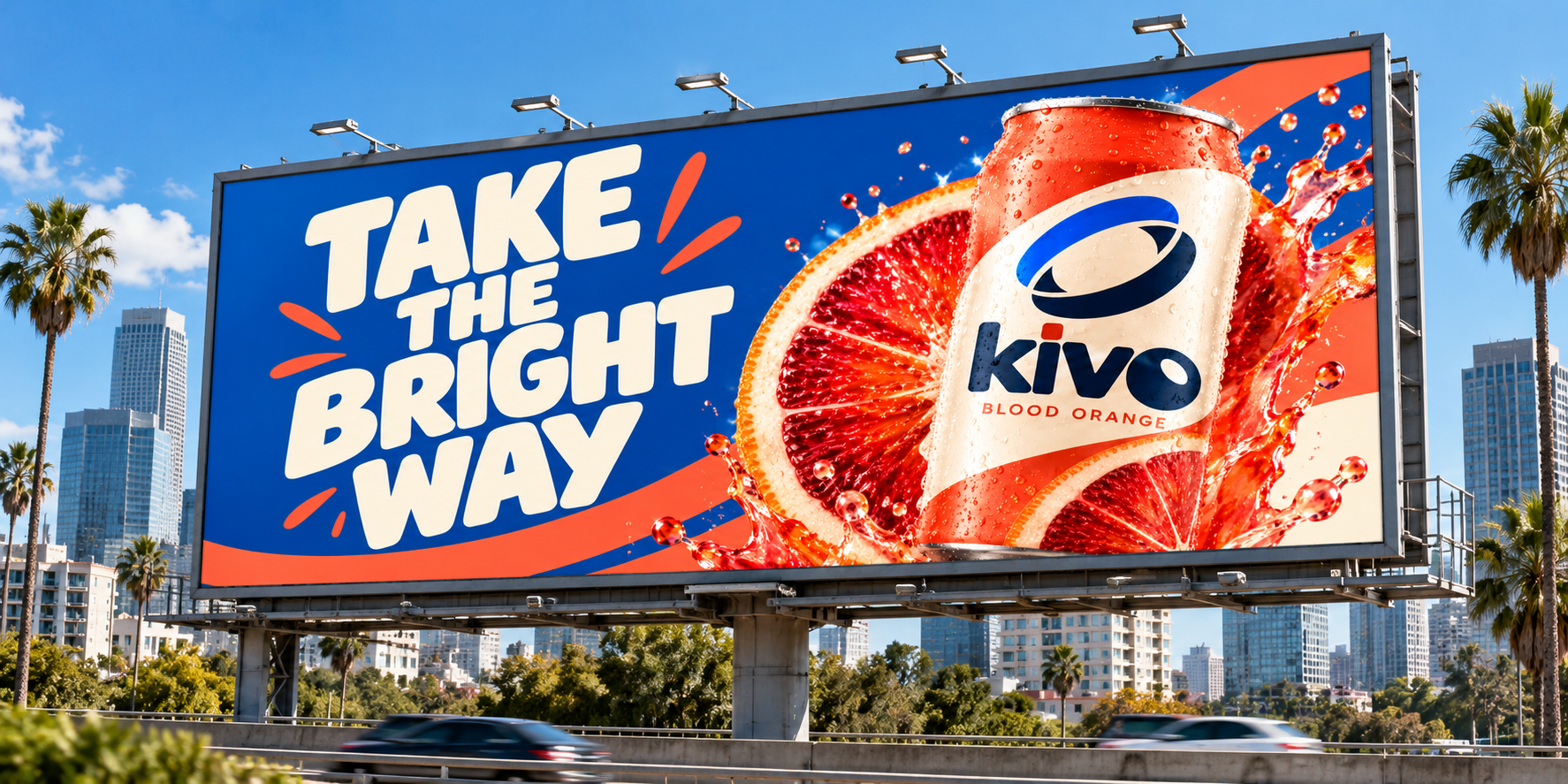
KIVO is a beverage brand with a bright visual identity built to travel from the shelf to the street and the screen.
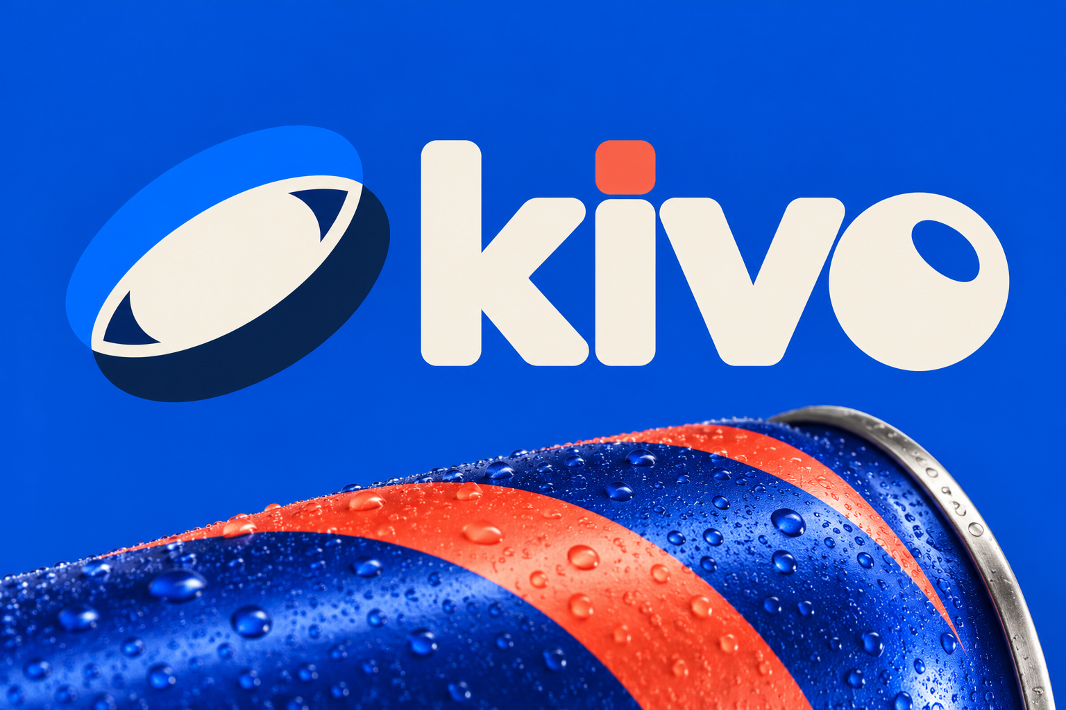
Display typography is bold and expressive. Simple sans-serif supporting type keeps product and campaign information easy to read. The KIVO wordmark is custom lettering, not a typeset font.
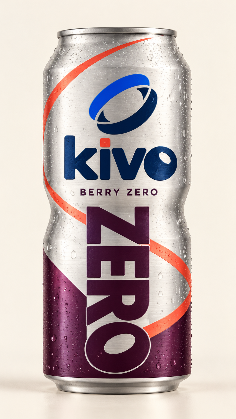
Metallic zero-soda cans and fruit-forward juice bottles share the same confident mark, with color and illustration giving each product its own character.
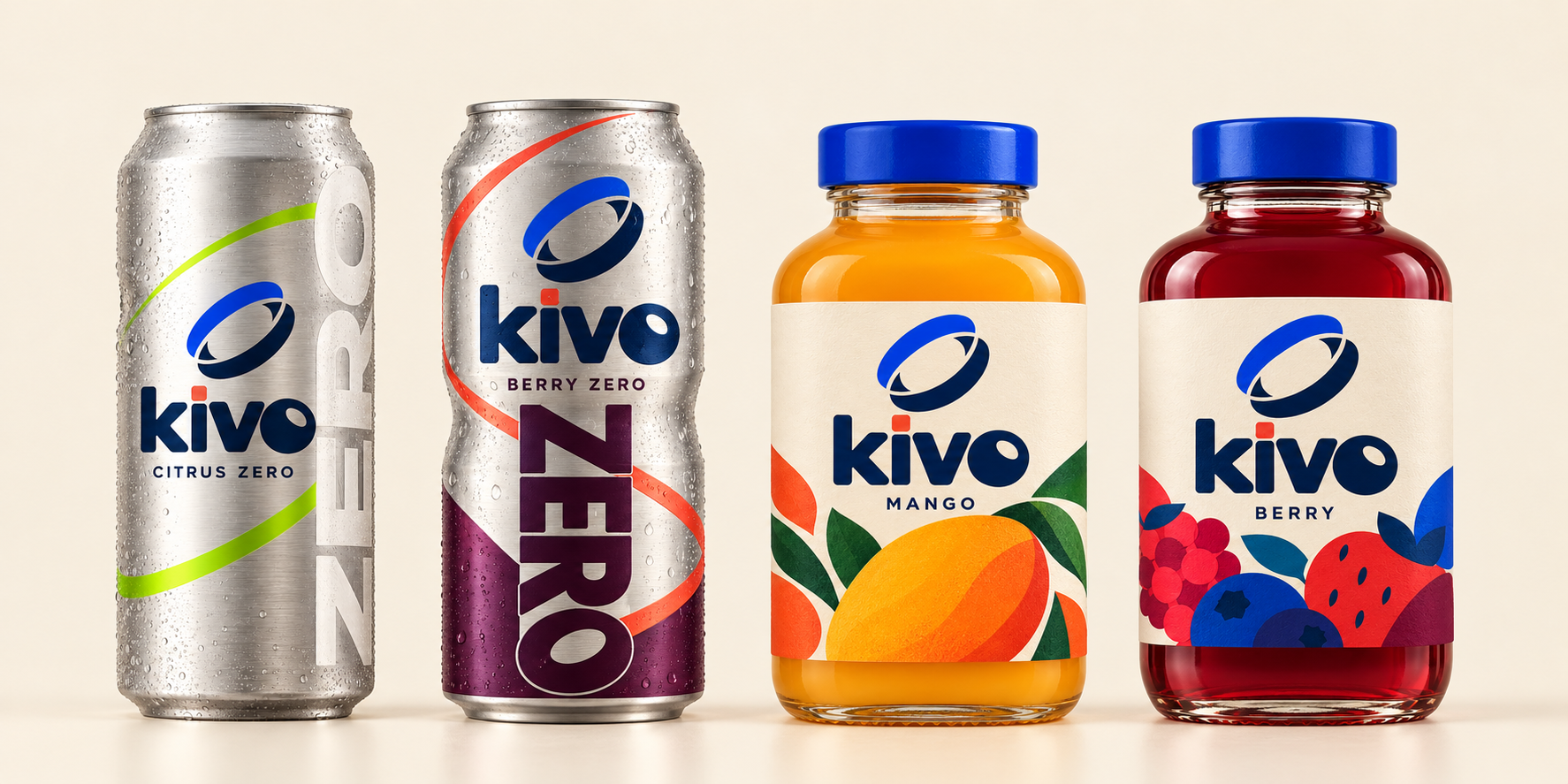
A visual library of product, people and flavor gives the brand room to show up in different ways.
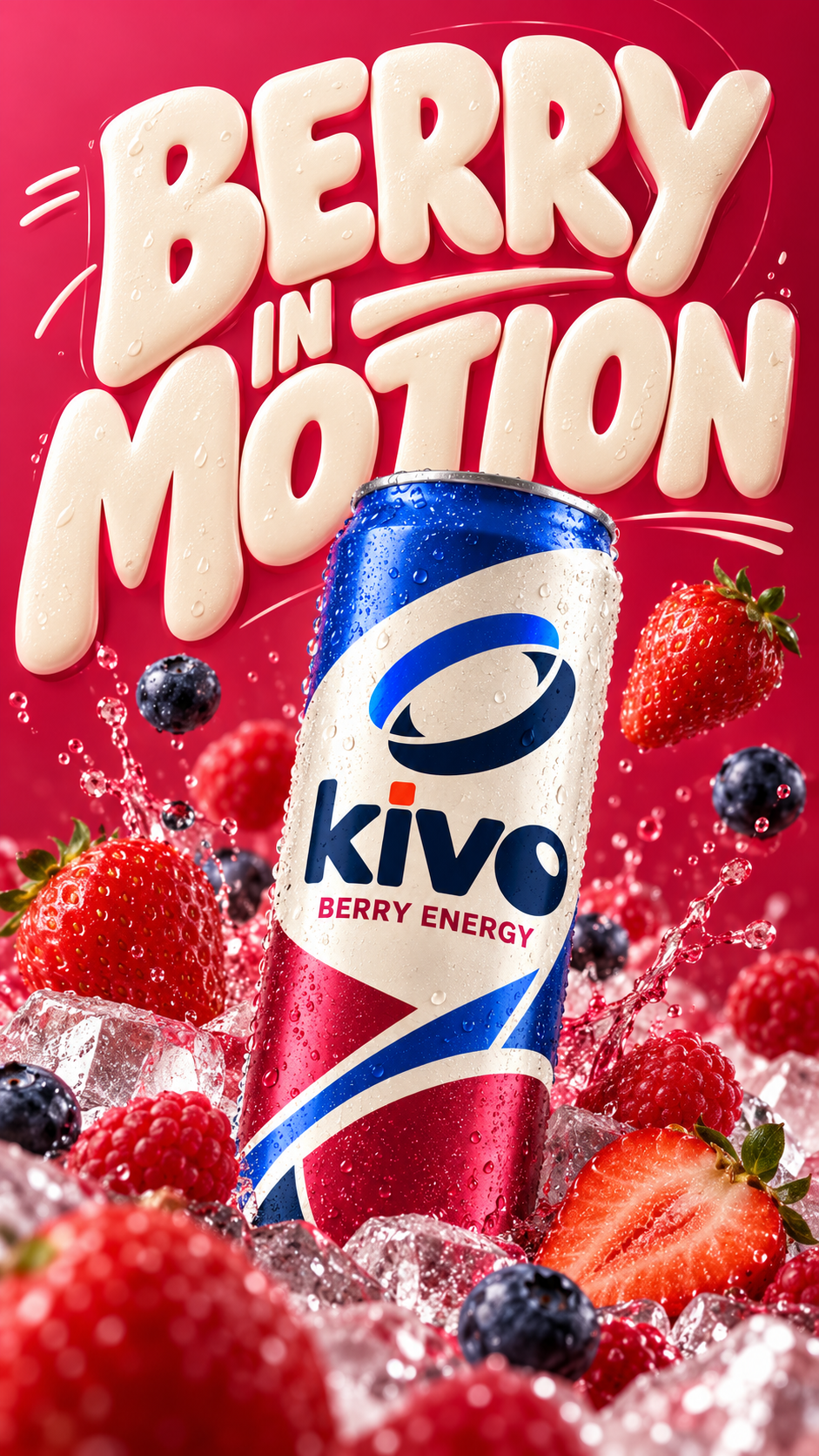
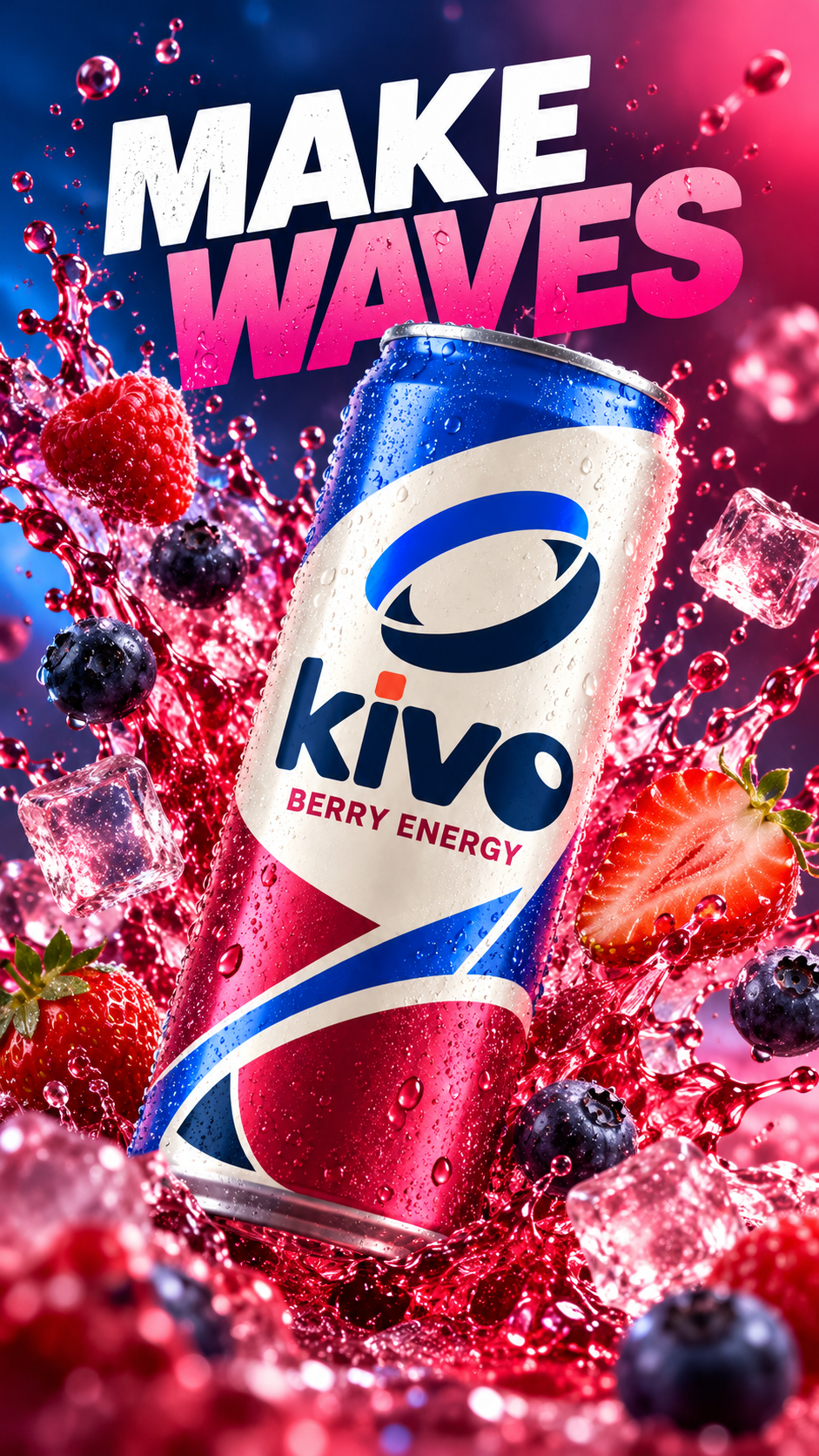
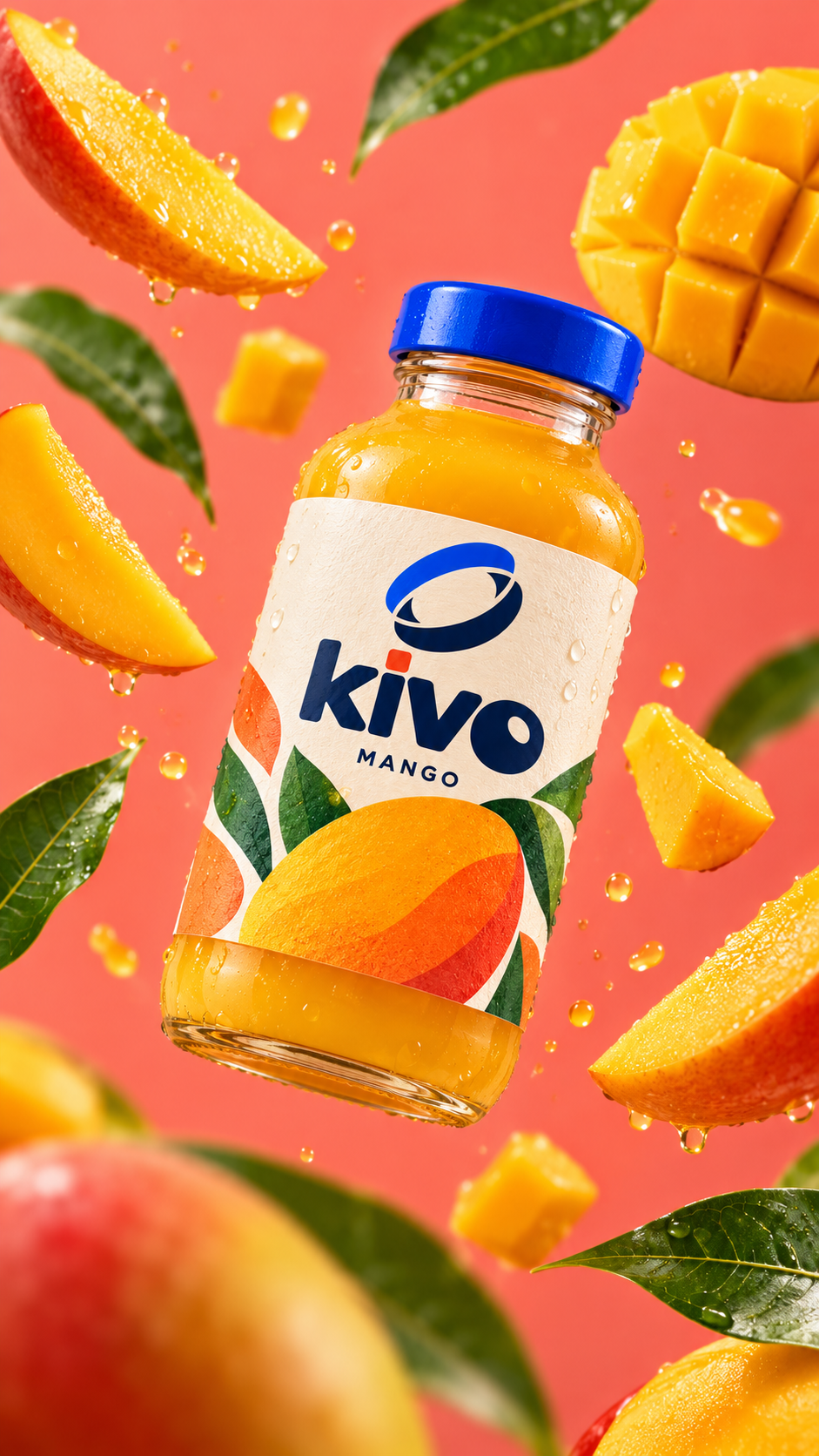
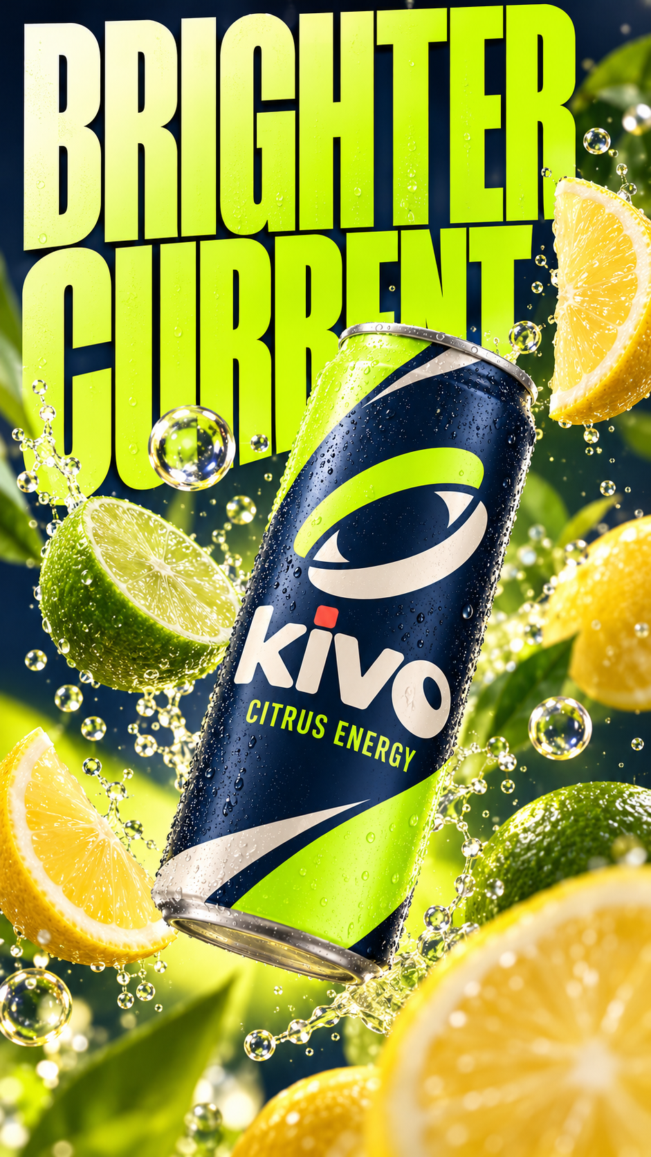
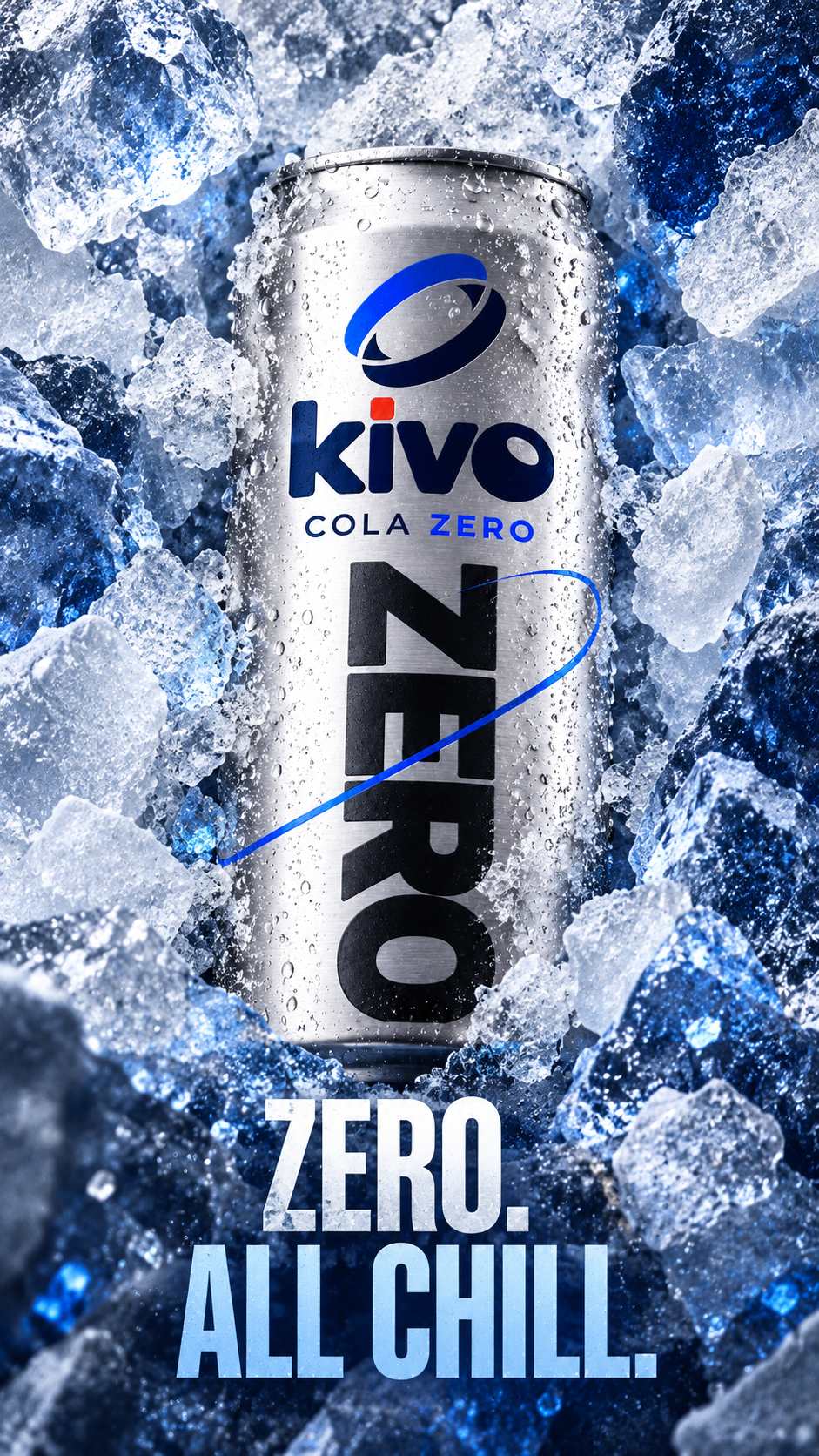
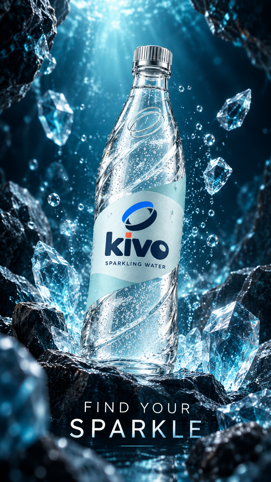
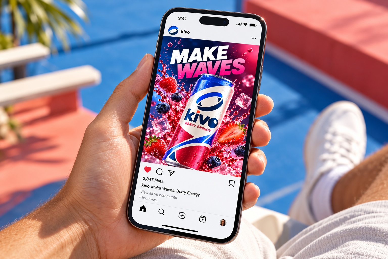
Campaigns carry the same vivid packaging and expressive photography into a mobile-first format.
Commercial concept storyboard
01 / A sunny day. A trip begins.
02 / Refreshment comes into view.
03 / The KIVO family closes the film.
A website concept that puts the products, color and campaign imagery front and center.
Big flavor. Good company. A little more color in every day.
EXPLORE OUR DRINKS ↗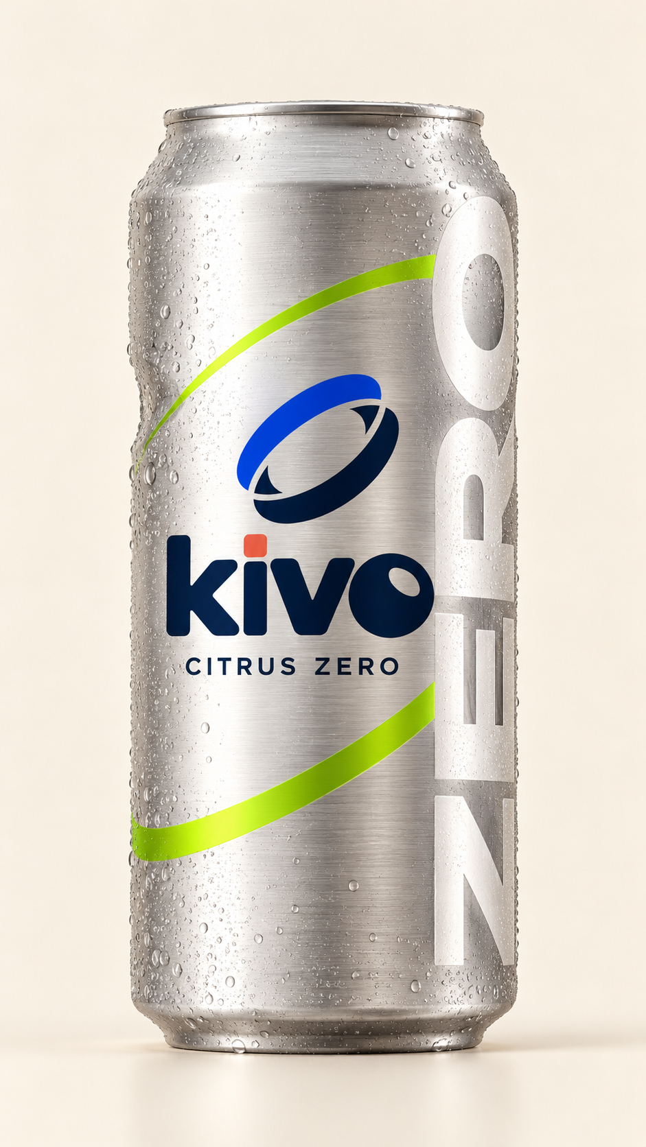
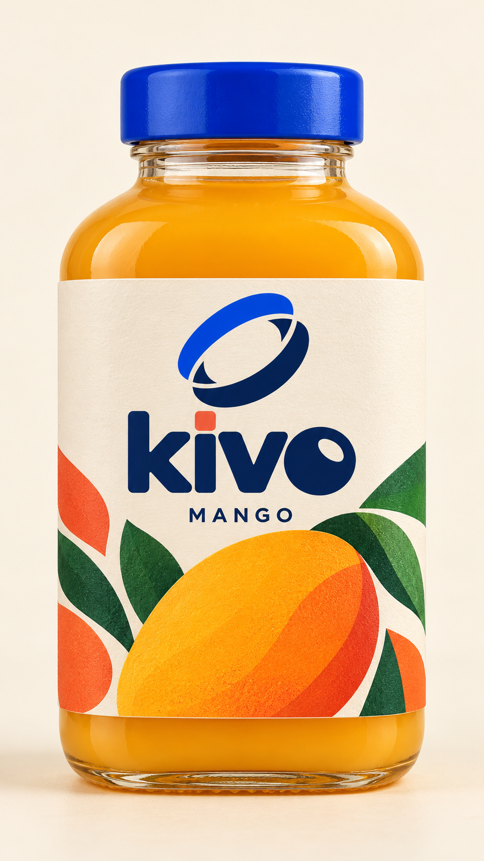
A product-led email concept introduces a new flavor with a simple message and a single clear action.
Say hello to a little more mango.